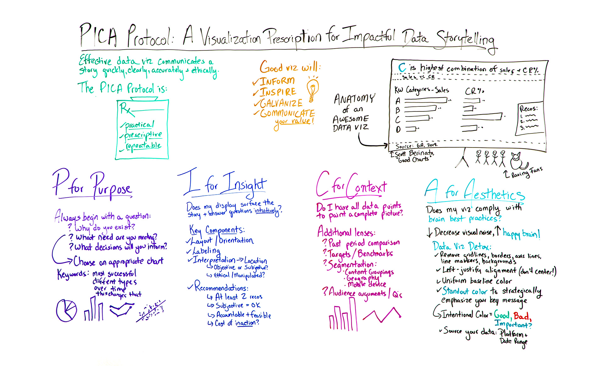
If you find your presentations are often met with a lukewarm reception, it's a sure sign it's time for you to invest in your data storytelling. By following a few smart rules, a structured approach to data visualization could make all the difference in how stakeholders receive and act upon your insights. In this edition of Whiteboard Friday, we're thrilled to welcome data viz expert Lea Pica to share her strategic methodology for creating highly effective charts.
Click on the whiteboard image above to open a high-resolution version in a new tab!
Video Transcription
Hello, Moz fans. Welcome to another edition of Whiteboard Friday. I'm here to talk to you this week about a very hot topic in the digital marketing space. So my name is Lea Pica, and I am a data storytelling trainer, coach, speaker, blogger, and podcaster at LeaPica.com.
I want to tell you a little story. So as 12 years I spent as a digital analyst and SEM, I used to present insights a lot, but nothing ever happened as a result of it. People fell asleep or never responded. No action was being taken. So I decided to figure out what was happening, and I learned all these great tricks for doing it.

What I learned in my journey is that effective data visualization communicates a story quickly, clearly, accurately, and ethically, and it had really four main goals — to inform decisions, to inspire action, to galvanize people, and most importantly to communicate the value of the work that you do.
Now, there are lots of things you can do, but I was struggling to find one specific process that was going to help me get from what I was trying to communicate to getting people to act on it.


